
3D Anaglyph galleries: Architecture
As a rule of thumb, we always "see in 3D", even when one eye is covered, because our brain interprets the incomplete information it receives and makes the best of it. So the volume we feel looking at shapes and objects is mostly brainwork.
And with 3D photography we can make it as real as possible.
Real because it's exaggerated, thus fake.
Perception of distance and space
Architecture is about elements, lines / space / surfaces / volume relationships, at least from an aesthetic, visual point of view.
Cities, buildings, decorative elements, their relative position in space & how they relate to each other show exactly that.
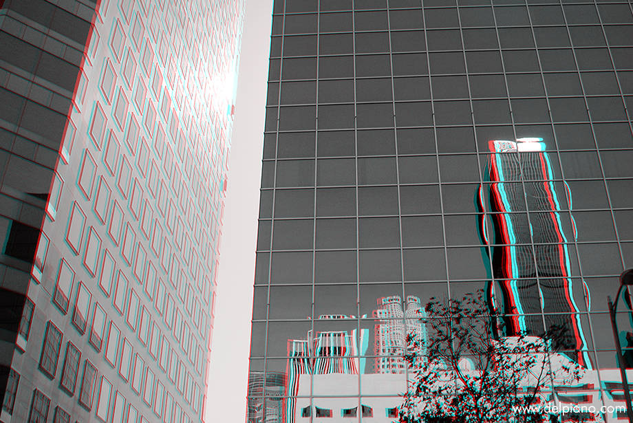
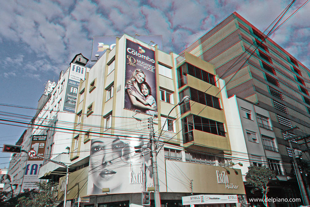
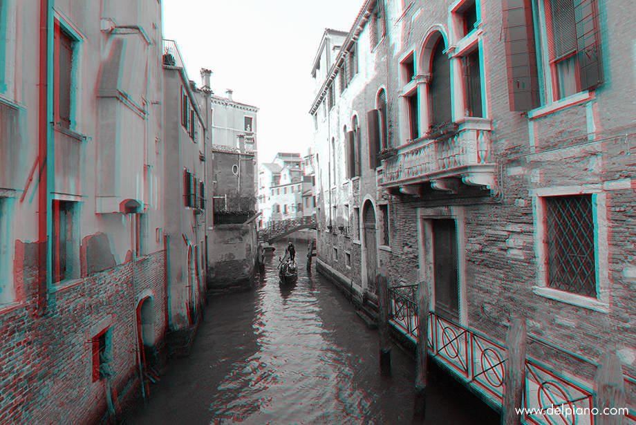
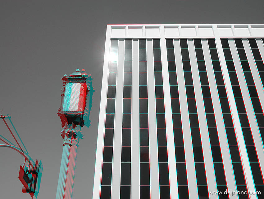
And 3D anaglyph imagery is incredibly powerful to re-create in the viewer's head the emotion of depth.
It re-creates something that is not really there, in reality.
3D Anaglyph Architecture Anaglyph Galleries
These pictures are not really a tentative comparison among architecture in 3 continents.
It's more like an excercise in making 3D effect as relevant as possible.
The common component in them is always to get as much a good depth feel as possible, to exaggerate the 3D effect to show the volumes at its best, and more.
I have also done some experiences on light/shadow/reflections and the right settings to use the 3D Slide Bracket I have developed, to achieve the best results.
During this process I have used 4 different camera setups:
- Nikon Coolpix 990
- Canon Powershot Pro1
- Ricoh Caplio GX100
- Canon Powershot S100 (best)
... and verified all possible variables in sharpness + contrast, to visually enhance in Photoshop the 3D effect to make it the most pleasing / powerful possible.
